Nintendo Japan’s Careers site publishes a new page about the UX/UI design of GameChat button. A very brief recap:
Why a dedicated button?
→ Stress-free single action to start chatting anytime
What are the design considerations?
→ Button size, placement, tactile feel, and icon
Why “C”?
→ Clear and comprehensible
→ Association with chat/communication/conversation
→ Easy to pronounce
→ Concise description in UI
→ Congruent with A/B buttons
Here are some icon design candidates during the development process:
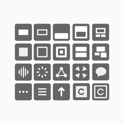
Let’s have a closer look at the System UI mockups during the GameChat development.
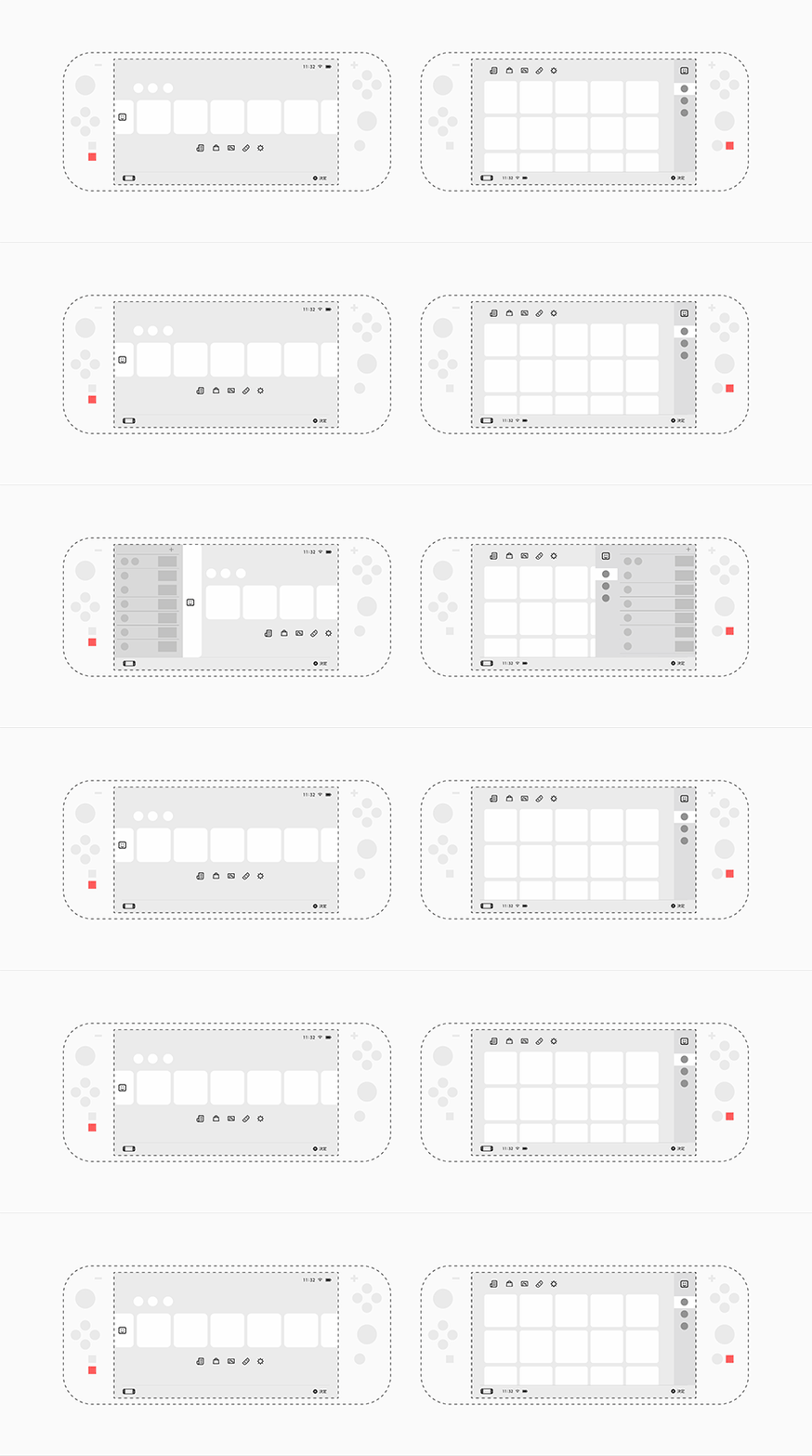
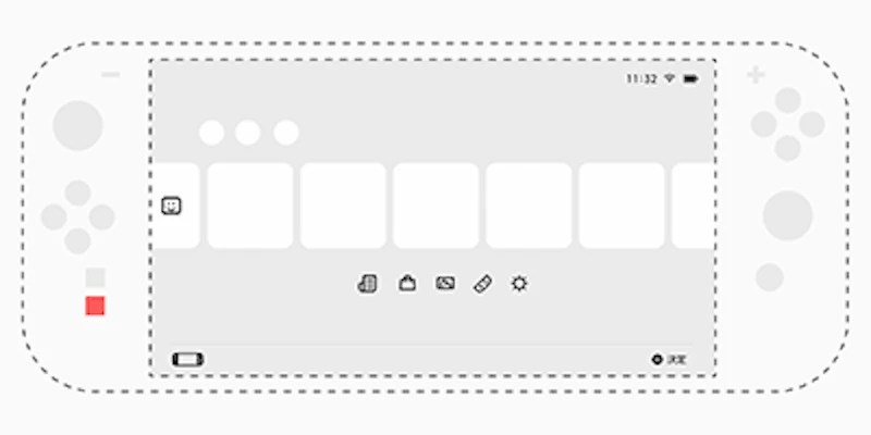
The first design is quite similar to the current System UI. The main differences include:
- A floating chat icon along the left edge
- Smaller title images to show more games (6 in a row)
- Physical C button placed below the Capture button
The second design is a bigger departure. The main differences from the final UI include:
- System apps at the upper left
- Games in a grid with vertical scrolling (5 per row)
- Chat icon and user list along the right edge
- Time, network status, and battery level at the bottom left
- Physical C button placed to the right of Home button
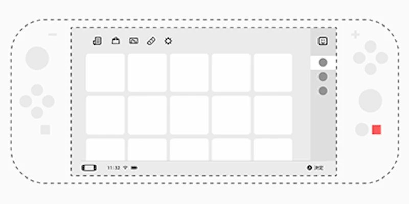
That last button placement would’ve been disastrous. Good thing they rejected it.
[Originally posted on 2026-03-06 Pacific Time]
