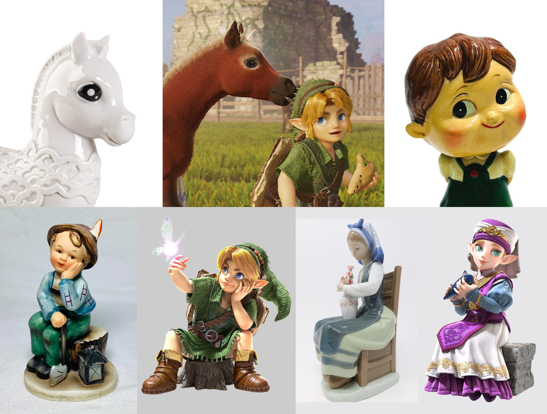
[The post was substantially rewritten on 2026-09-14] This may be a good time to remind Zelda fans of the Miyamoto lore that “Ocarina of Time” is a Japanese pun on “ceramic ocarina”. More importantly, Aonuma said in the Zelda Direct that the OOT remake’s visual is to evoke nostalgia (“懐かしさ”).
For Japanese, it’s most likely referring to Shōwa nostalgia (“昭和ノスタルジア” or “昭和レトロ”). Moreover, post WWII (middle Shōwa era) the US-led occupation attempted to deindustrialize Japan by dismantling heavy industries, forcing the nation to rely on farming, fishing, and handicraft production. During that time, ceramics and toys were exported to the US cheaply in large quantity, all carrying the mandatory “Made in Occupied Japan” stamp.

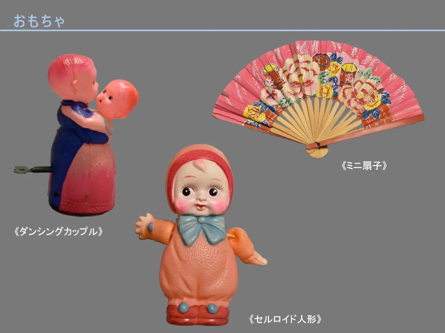
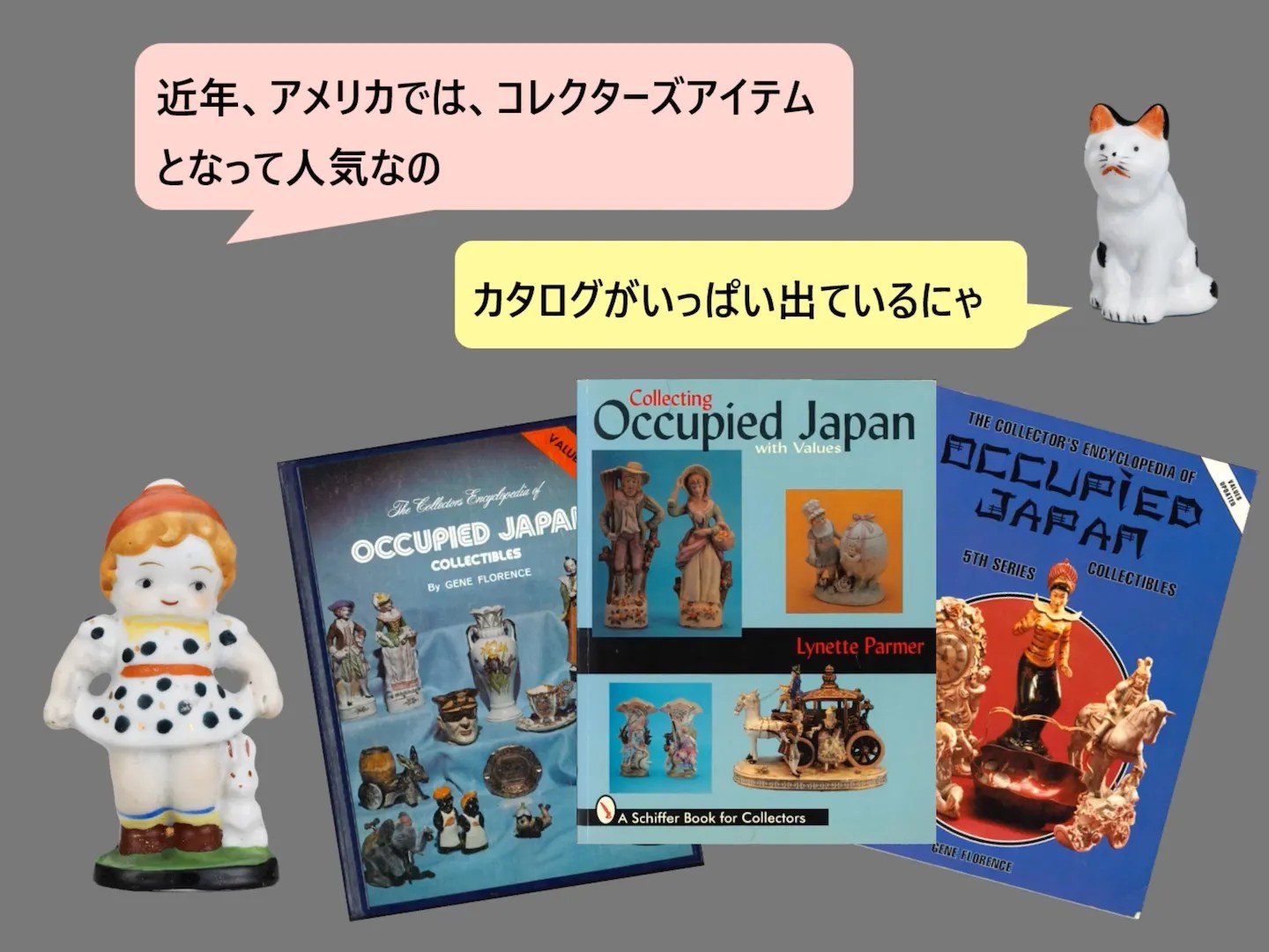
![Screenshot from video “Made in Occupied Japan” by 城西国際大学水田美術館 (Mizuta Museum of Art, Josai International University):
https://www.youtube.com/watch?v=5OTcqtEHNTA
裏印もいろいろあるにゃ?
[Made in Occupied Japan] [Occupied Japan] とともに、製造元や貿易商社、輸出先のバイヤーのマークが記されているものがあるのよ
(Photos of four different brand’s “Made in Occupied Japan” stamps)](https://ninpatentswatch.com/wp-content/uploads/2026/09/bafkreicccmld3mebycmakrg3lzd25dq556hpf27sctlxqbxkuwuu4pza34.webp)
For these reasons I don’t think it was a coincidence that OOT remake’s character design bears the resemblance of ceramic figurine aesthetic. Regardless whether my interpretation is in the ball park, there’s undoubtedly an artistic intent. The “AI” or “hire this man” charges are wide of the mark.
P.S.: One absolutely can dislike a piece of creative work. This post is an attempt to trace the inspiration for the remake’s art direction, not to convince anyone to appreciate it.
P.P.S: It seems that the character skin’s texture and sheen give a nod to the inspiration, but isn’t meant to look like ceramic literally. The mismatch between hyper-detailed clothes and smooth-looking character might also be an allusion to porcelain doll clothing.
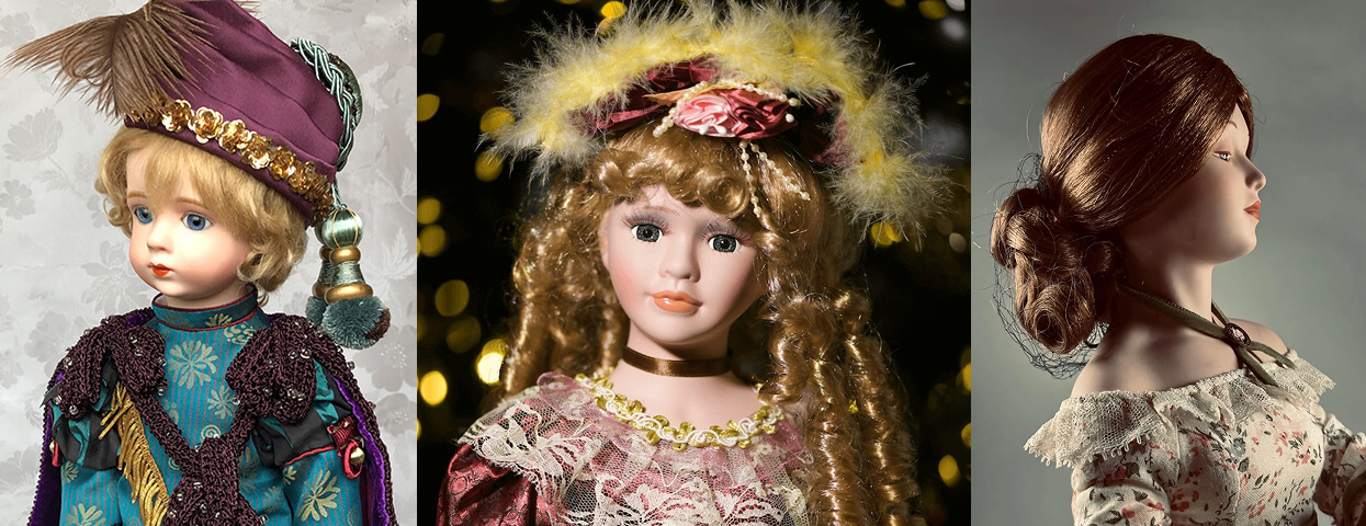
(Image sources in alt text)
[Originally posted on 2026-09-08 Pacific Time]
